


Jobs Listings
An interactive map, which displays jobs around the USA, allowing the user to search for a specific job.

Lights Projects

JobTeamByg Departments
An interactive map of the departments of the Denmark company JobTeamByg

Savannah Neighbourhoods
Online interactive map of some neighbourhoods in Savannah, Georgia, USA

Animated Routes between POIs
Online map of animated routes between points of interest in San Francisco, USA

Hurra Talents
An interactive map, which shows the location of the people, who work for the international company “Hurra”.
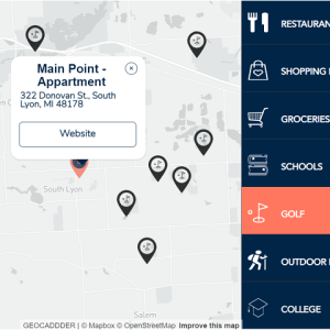
Donovan Street
An interactive map, which displays the surrounding locations around the neighbourhood of of the “Donovan Street Apartment Homes”, offered by the US company “Paloosh Properties”.

Food Points of Interest
Online map of foot points of interest in Hamburg, Germany, with clustering and combining the points into different categories